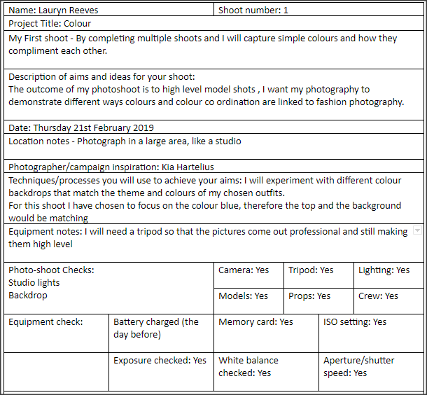
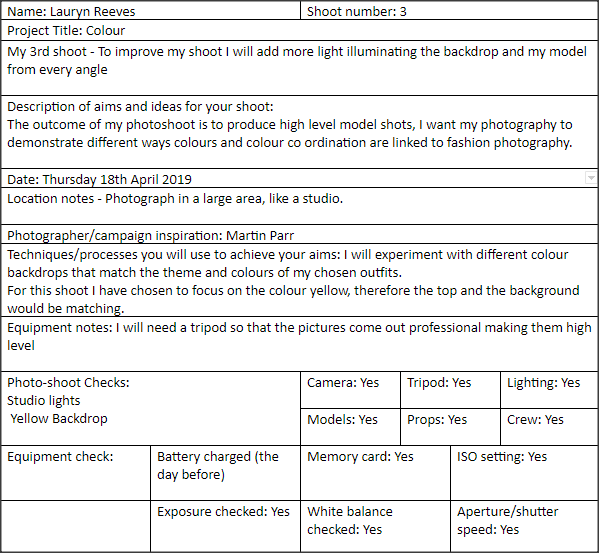
Statement Of Intent
Project Theme: colour
I aim to produce a portfolio of work demonstrating my ideas,development, creative work and reflection based around the theme of 'colours'. At the end of my exam prep time, I will choose my best photographs and mount them so they can easily be viewed.
For my initial research I will start by looking into fashion photographers while exploring the different ways they use colour in their work. At the moment, I have two in mind that I would like to look at. These are Martin Parr and Kia Hartelius. I chose two photographers because they display different ways of looking at fashion and the creativity within it. I have chosen to focus on accessories and different fabrics because I feel as though it is a significant feature in fashion today.
When I chose this theme, my initial thoughts were looking into neon colours in bright lights and pop art type editing. After thinking about it I realise that there's so many different routes that my work could go down, for example looking into block colours along with primary colours in trends and fashion. I can also experiment with a range of angles, with full length shots and also a range of close ups showing the detail of the accessories.
To show progression through my work I will start by photographing the current clothing trends around me. I will then develop these images further by taking more ideas from them and editing them. I hope to venture further by then experimenting with back drops and seeing how the different colours of the background compliment the fabrics in the outfit. I already have a lot of ideas running through my head for this project which will propel me in the right direction.
I would like to experiment with a wider range of techniques within my work. I have a 18-55mm lens which I will take most of my photographs on, but I would also like to experiment with more professional photography, by coming in on the holidays and taking studio shots. I will also push myself to be more creative in Photoshop to touch up my images . I will also experiment with more popping colour, following my exam question.
I have 10 weeks to produce a website page of work toward the production of my final piece. I aim to complete my initial research within the 1st 2 weeks and start photographing in the 3rd week in order to give me the time I need to show my progression, I will then have a 10 hour practical exam where I will print my final photos showing them as magazine covers.
As my project progresses I will label my ideas and development clearly. This will hep me reflect on the work I have produced.I will mainly seek advice from my Tutor and peers on how to make my work better, as i'm always aiming to push myself to new levels. After the creation of my final piece I will write a final evaluation on the project as a whole reflecting on what went well and what I would do differently or change given the time.
Moodboard
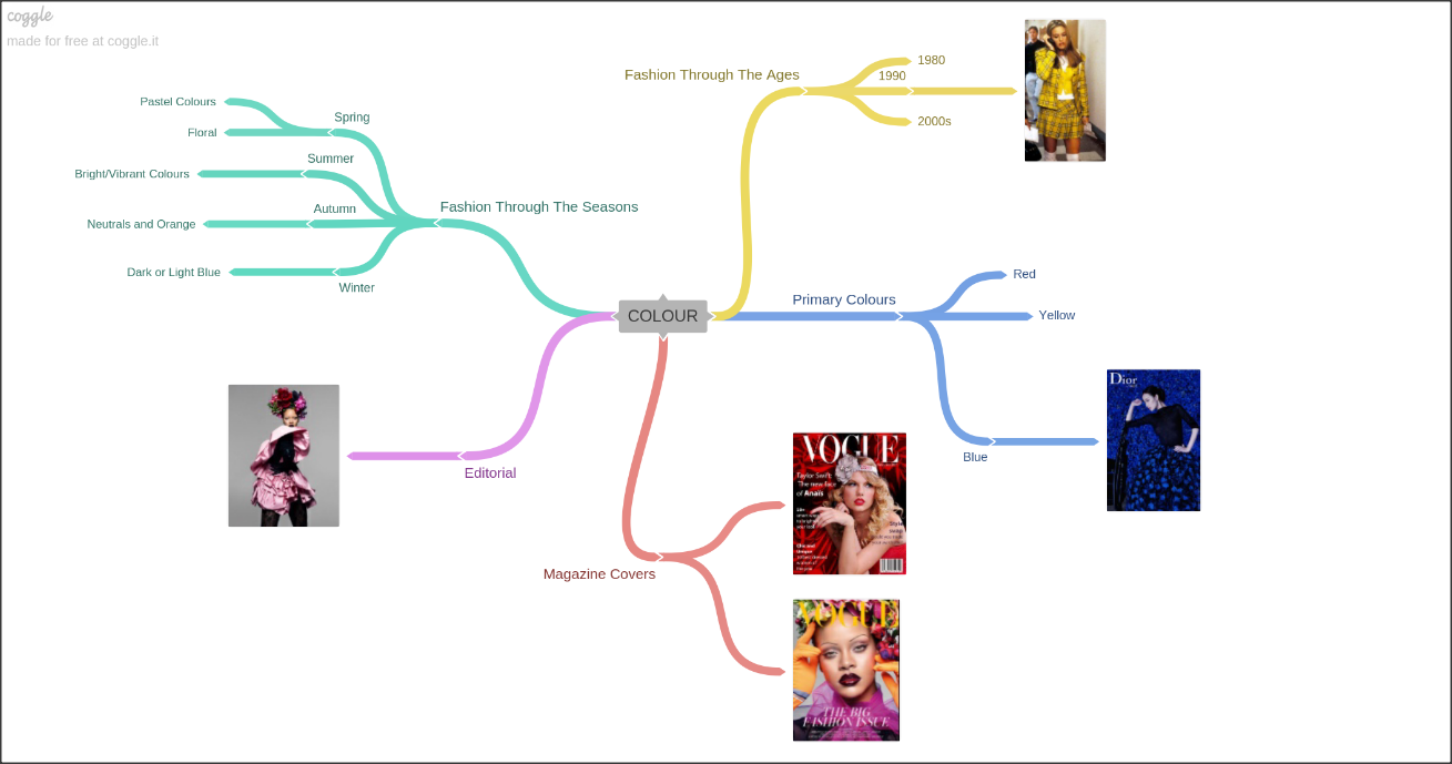
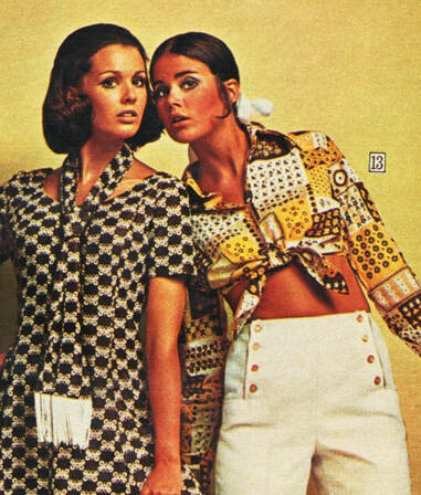
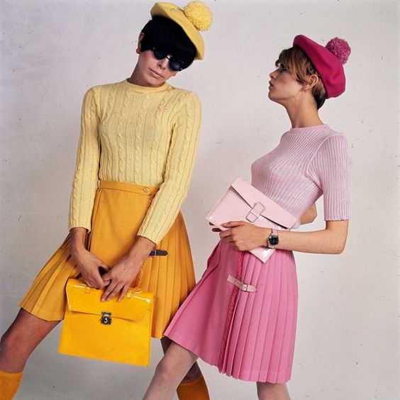
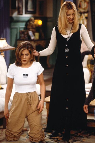
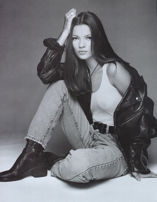
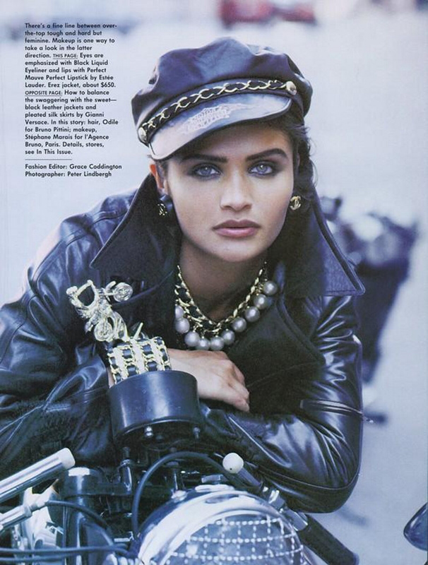
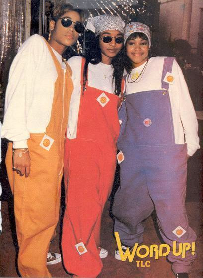
Fashion Through The Ages
1970
|
|


Trends In The 1970
- Technicolor
- Platform Shoes
1980/1990
|
|
|
|
|
Trends In The 1980
- Leg Warmers
- Fingerless Gloves
- Huge Earrings
Fashion Through The Seasons
Spring,Summer, Autumn & Winter
|
|
|
|
ARTIST RESEARCH :
Kia Hartelius
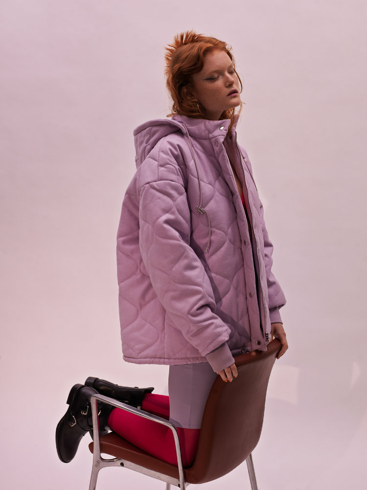
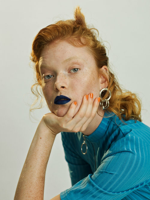
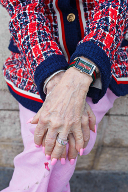
These are a collection of images from the photographer Kia Hartelius who enjoys taking pictures 'with clear colours and an alternative casting' in an attempt to provoke emotions and challenge perceptions to reshape and define them. I am really interested in her photography website as she captures all my ideas and inspires me. In particular I am fond of the way she colour co ordinates the models clothes with the background. In picture 1, the light pink perfectly goes with the duskier pink that the model is wearing giving the picture a sense of depth and definition. In picture 2 the model wears a slightly darker shade of blue, complimenting the colour of her top and the orange nail polishes perfectly brings out her ginger hair.
|
|
|
|
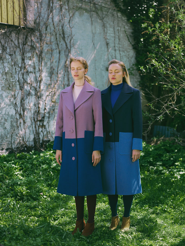
This picture was taken from Kia Hartelius' website. Her project was titled 'Fjord Ruby' where these models advertised coats for a company.
This picture shows two models standing still in contrasting coats. Their eyes are closed as they stand in a sea of grass against a white wall filled with twigs. The picture is in colour, which perfectly suits the theme because if it was black and white the variation between colours wouldn't of been as emphasised. The focus point of the picture are the two models who are dressed absolutely the same yet the shades and tints of the clothes completely contradict each other allowing the blues and pinks to stand out. The photographer has considered where he has placed the models very carefully, the position of their coats are lined up perfectly with one another. In addition to this the vertical lines on the wall also line up with the situation of her legs. The picture links to the theme of colour because of the use of these colours compliment each other extremely well as they are exact opposite and are positioned in the exact same- yet opposite place. The strengths of this image are the way it has a peaceful and harmonious demeanor, it represents fashion and the of it in a simplistic way without the typical studio shot showing the photographers creativity |
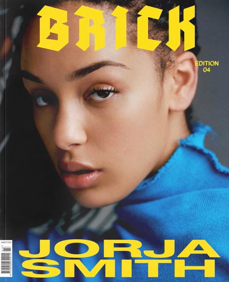
Martin Parr
Gucci Cruise 2019 lookbook:
Spotlighting the bold prints and Chateau Marmont-inspired pieces. Shot in various locations in Cannes.
|
|
|
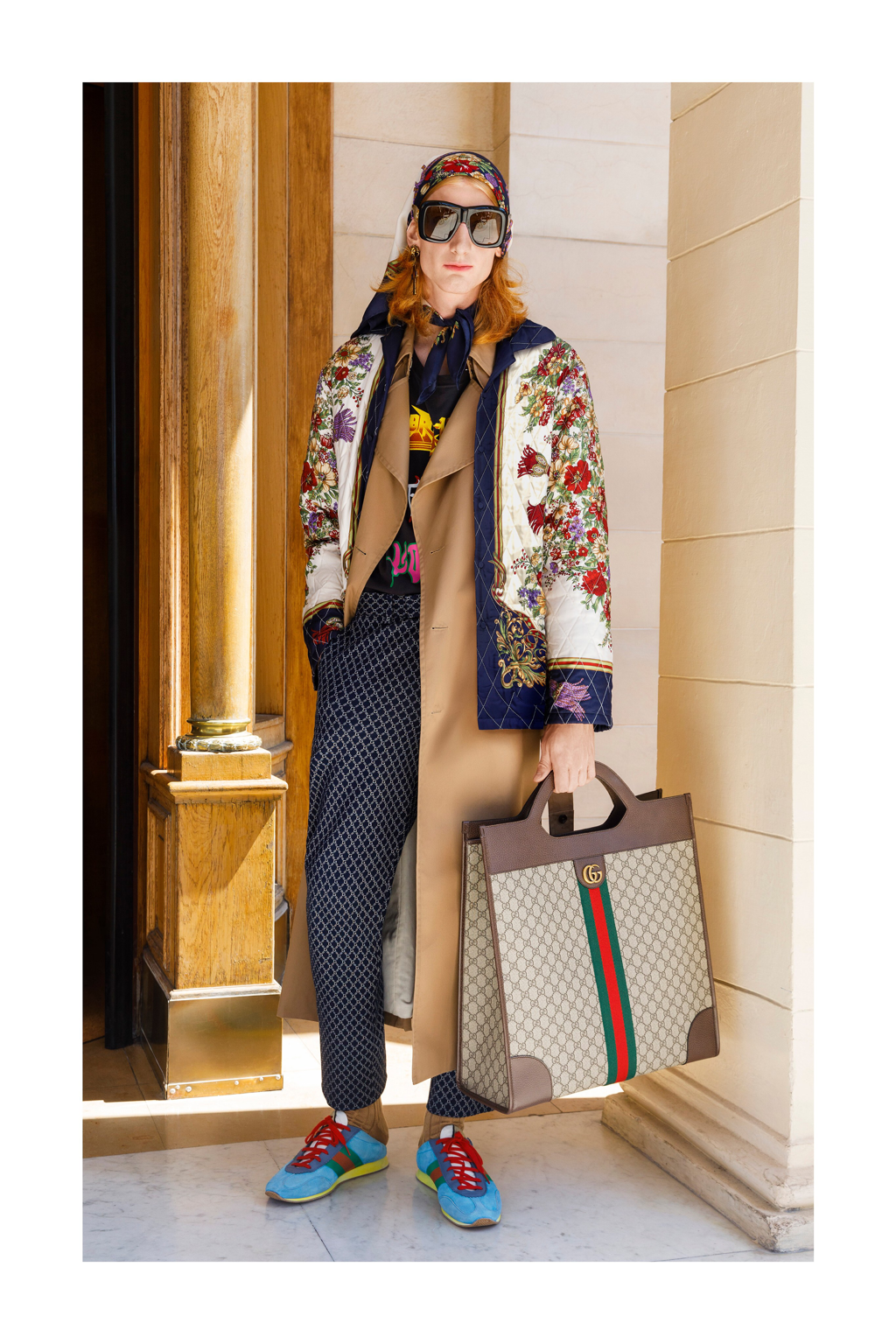
This picture was taken as part of Gucci's Menswear Cruise 2019 look book: a series of almost 80 photographs in Cannes, capturing outfits in some of the most iconic places in the city. For example the Carlton hotel, the Croisette and the beach club. The look book is a combination of Scottish clothes, leather boots , printed blazers and fur. Demonstrating not only a mix of textures but also prints.
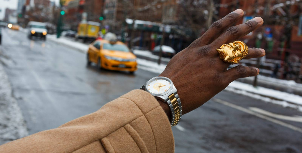
In this picture the model wears an assortment of clashing patterns, stripes & checker and isn't in black and white as if it was it would take away the boldness of the picture.
The focus point of the picture is the model, he has been placed directly in the center of the picture and therefore rule of thirds hasn't been used. As a viewer my eyes are instantly directed to to middle but in particular the bright blue and green checkered jacket as it presents a daring and bold look to the picture while it is standing out around everything else. I would assume that the photographer hasn't used a tripod as its not a studio shot therefore a studio set up wouldn't of been needed to achieve this look. I have noticed that there is a separation between the foreground and the background which makes the bright blue of the sky a lot more distinct when contrasting the light creams and brassy colours in the foreground.
Contrasting of the boldness of colours has been clearly demonstrated in this photograph making it strongly link to my project theme with an abundance of relevance. The purpose behind this project is to show the different ways that you can be creative in fashion as the photographer has mixed prints that don't ordinarily go together. I may even go as far to say that Gucci are encouraging their shoppers to go against the social norms in order to stand out as an individual
Personally, I do like this picture however I prefer the simplistic approach that Kia Hartelius has in her pictures. For me this picture has a lot going on and is slightly overwhelming. Possibly other people that would like this look and photography would have to be more out going and bold.
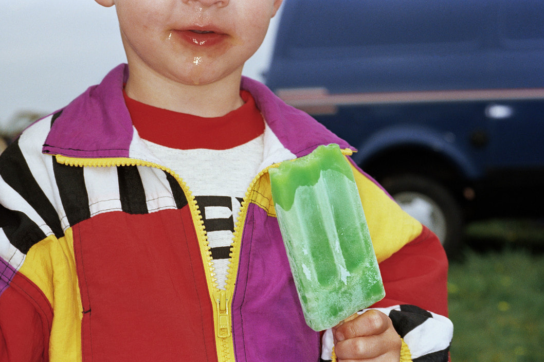
This picture shows a young boy in a vibrant colour blocked jacket, while eating a green ice lolly. The photo isn't in black and white as I believe if it was the picture would then look dull and drown out everything that is exciting about it, as it is full of colour.
The focus point is the boys outfit and his food, I don't think that the boy is significant as the photographer has cropped more than half of his face out and the background is blurred making his clothes and the prints the main view point. The lighting is bright accentuating the surroundings even more. As a viewer my eyes are instantly draw to the ice lolly because of its vibrant green colour it is one of the focus points, mainly because the green is so contrasting with the other colours. I don't think a tripod has been used as it looks like a spare of the moment shot rather than a studio shot.
This picture clearly links to the theme of colour because the photographer has captured the most vivid and blazing colours in one picture, this effectively highlights the use of bright colours in on picture.
The strength of this picture is how the colours have been captured together, perfectly complimenting each other and work as a good representation of colour. In my opinion the colours featured could compliment each other a little more, for example different shades of blues or orange to make it appear moer satisfying however the colours purpose in this photo was purumably to stand out.
Personally, I don’t like this picture in relation to my theme. I think that other pictures could of been a more accurate representative of the look that im trying to achieve. Not only that but I feel the way the picture has been took makes it look random and I fail to see the importance of it apart from the colours that it possesses
Close Ups Of Accessories
|
|
|
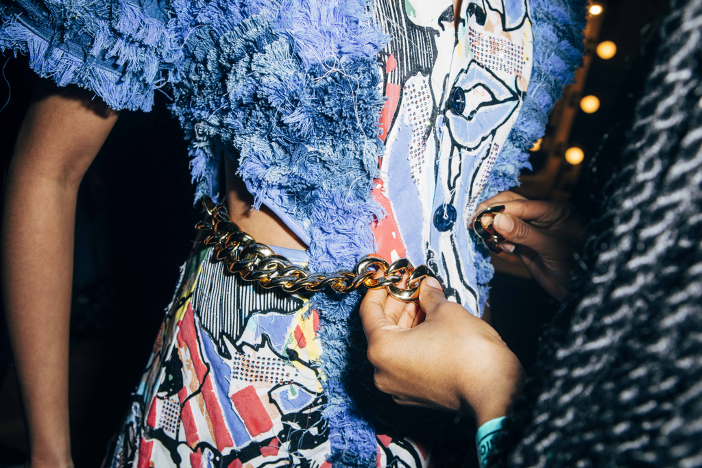
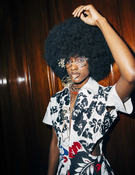
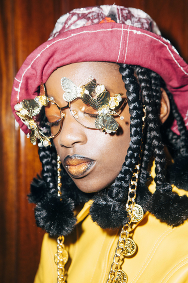
TOLU COKER’S LONDON FASHION WEEK DEBUT: 50 SHADES OF COOL
Described as one of the most dynamic fashion shoots showcasing a playground of textures, print mash-ups, reworked denims and recycled leather demonstrating an abundance of ways that fabrics can be used to contribute to fashion.
The first picture in particular inspires me because it perfectly captures the detail of the chain and highlights each aspect of the picture. I would also like to incorporate close ups of accessories instead of limiting myself to only full length shots.
The designer, Tolo displays an alternative style of fashion in comparison to the clarity of the previous block colours as she demonstrates editorial fashion with meaning behind it and creativity as apposed to the simplicity of Kia Hartelius’ work.
In addition to this, the way the artist explores different shades of blues to seems inviting and gives the picture a sense of dimension especially as it’s taken up close allowing the audience to take in each detail of the clothing.
|
|
My Plan:
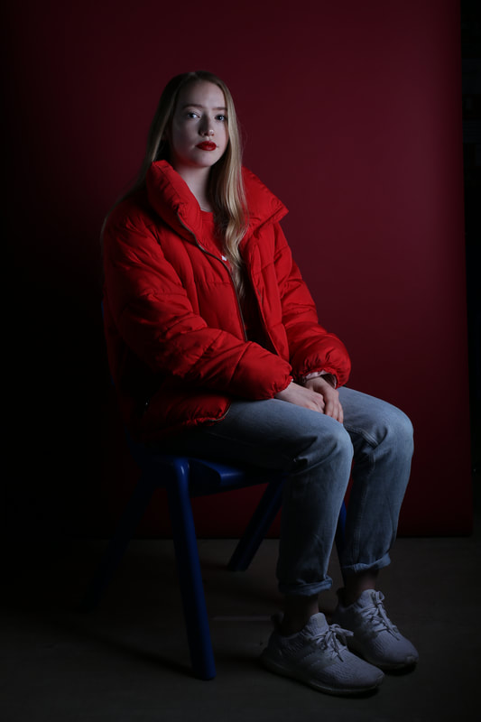
RED SHOOT
|
|
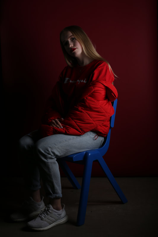
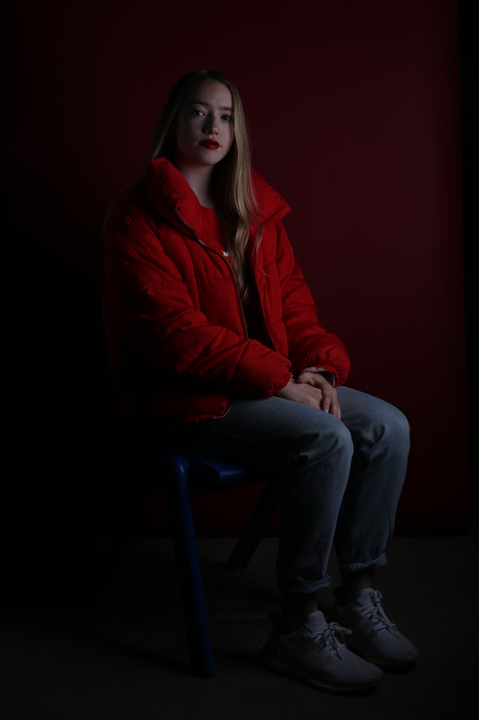
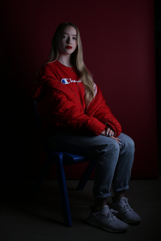
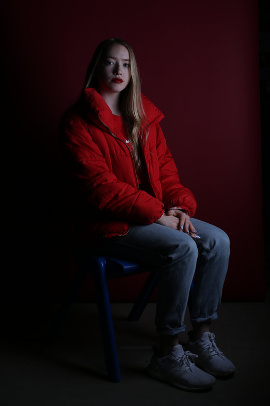
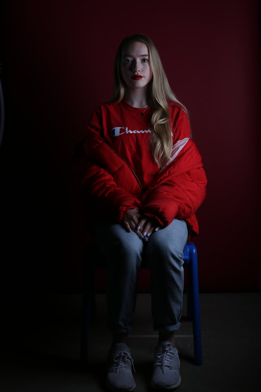
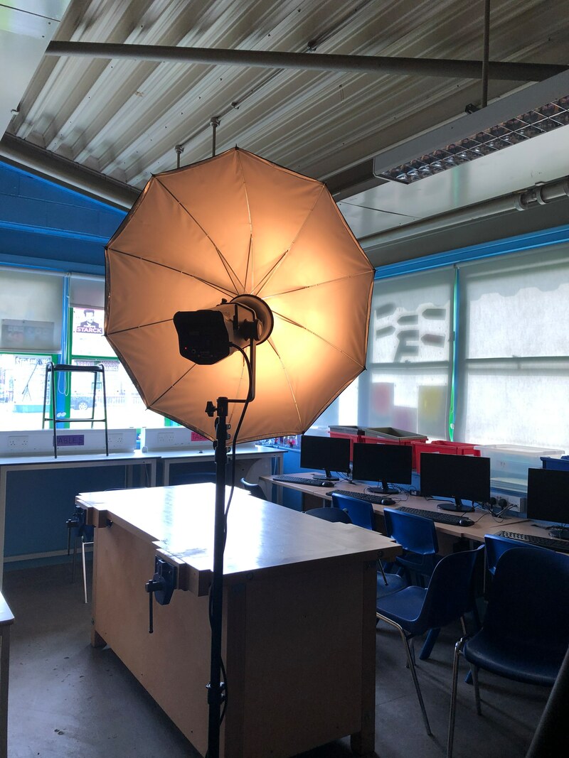
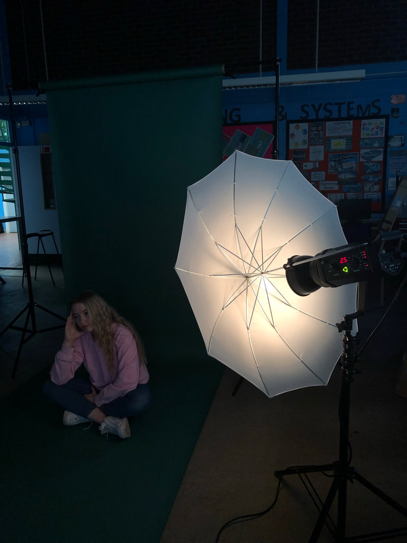
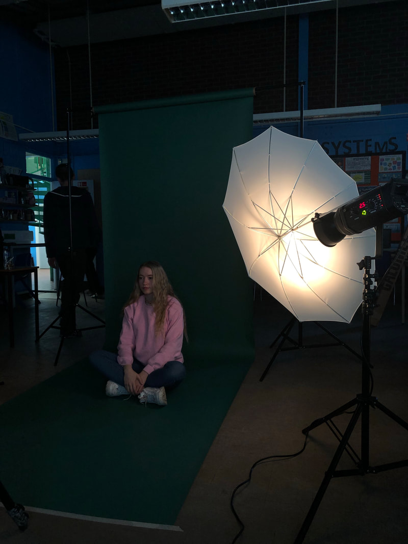
My 1st Shoot
|
|
|
|
|
|
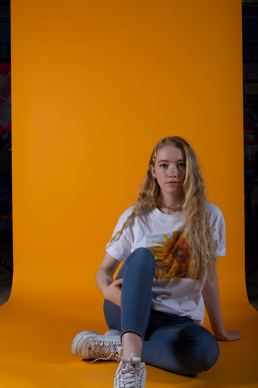
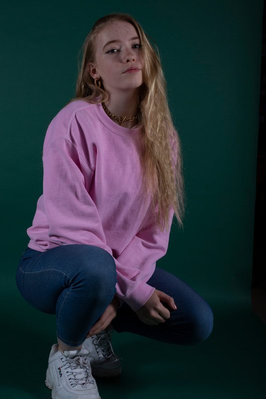
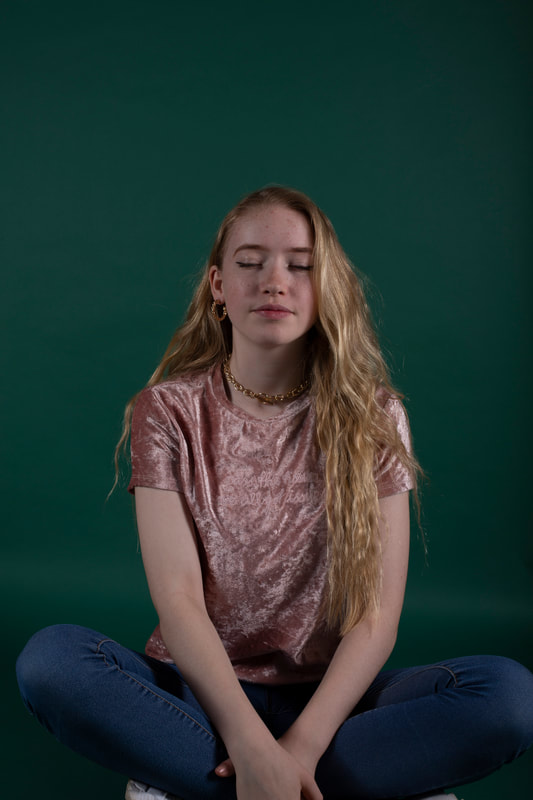
Best Photo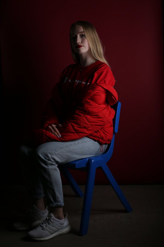
I chose to position my model away from the light to cast a shadow on the left side of her body which highlighted her hair along with her top, exactly what I wanted.
|
Worst Photo
As it was one of the first pictures I took it turned out as one of the worst. I had not set up properly and the lights weren't bright enough causing my models face to barely be noticed.
|
Developing my ideas in Photoshop
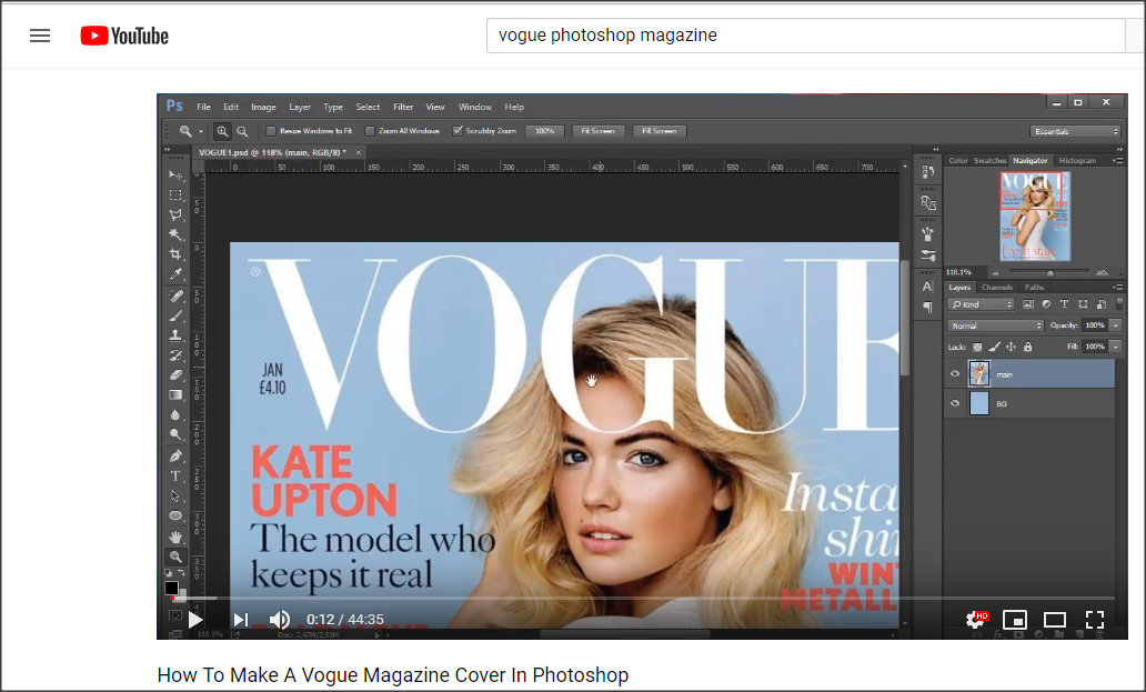
https://www.youtube.com/watch?v=P2EBntHrhNA


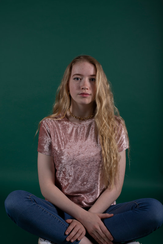
Best Photo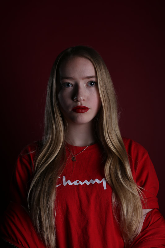
I asked my model to look away from the camera to explore different poses I really liked this one because I also managed to capture her perfectly centre.
|
Worst Photo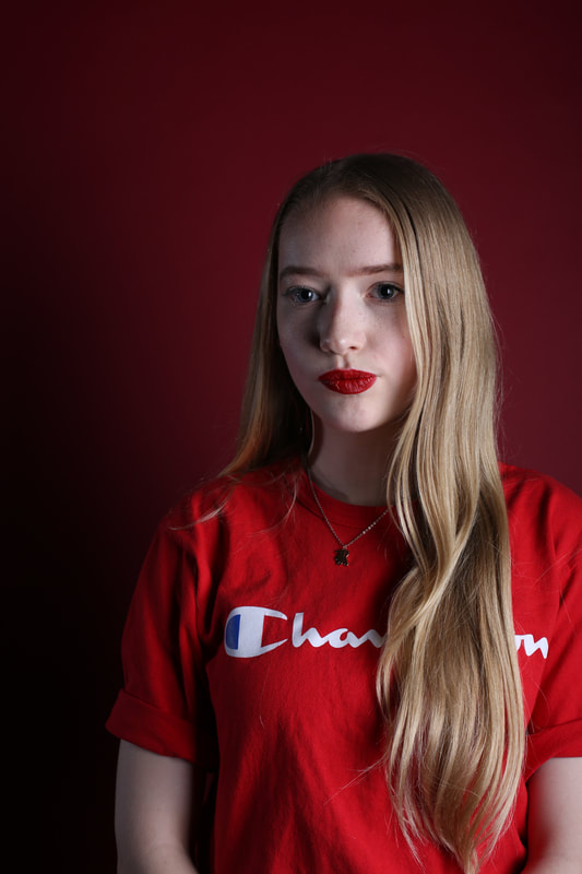
For this picture my model wasn't paying attention as she looked away from the camera briefly, the timing wasn't right and therefore it's my worst picture.
|


Best Photo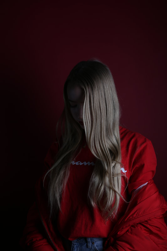
This picture perfectly captures the different tones in her blonde hair. The red and pale tones stand out as they contrast between the different light and dark shades.
|
Worst Photo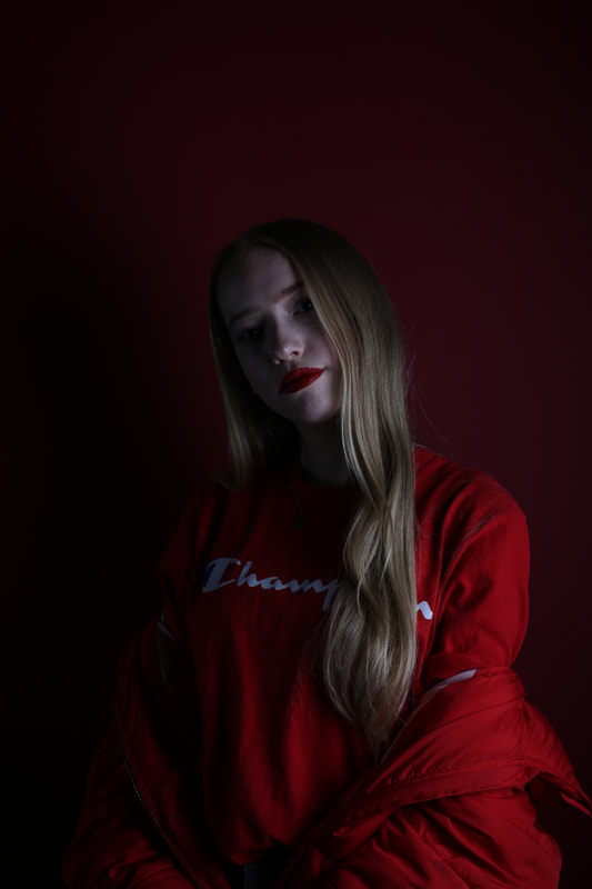
The purpose of this pose was to capture the blonde highlights in the picture and so her face being in it isn't really necessary
|


Marcelo Monreal


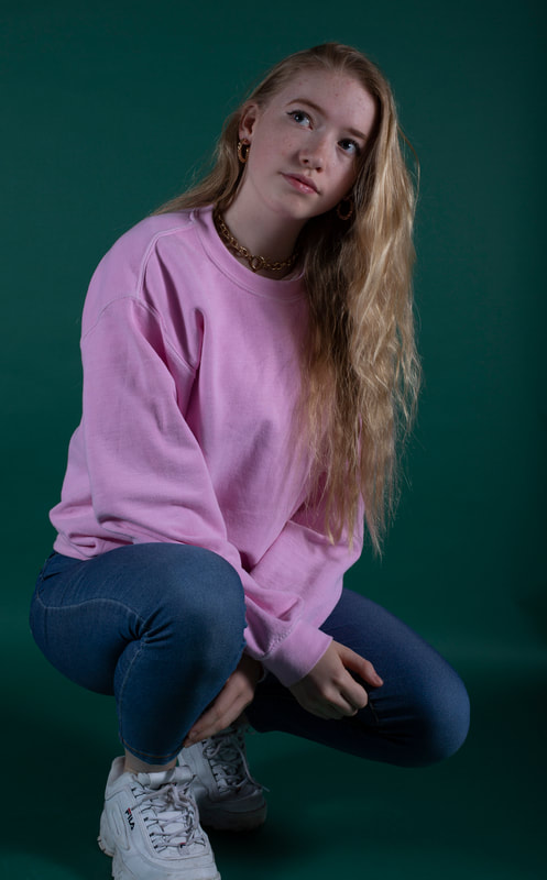
Best Photo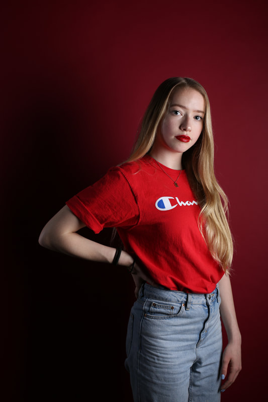
This picture appears more relaxed to me which is exactly what I wanted to capture
|
Worst Photo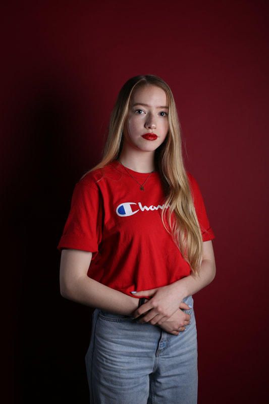
For this picture the only thing I dislike is the pose that she is doing as I prefer if she relaxed a bit more as shown in my best picture.
|
BLUE SHOOT

|
|
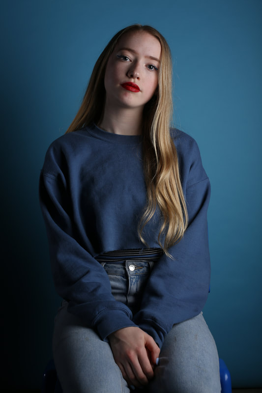
My 2nd Shoot
I then changed the background to a lighter shade sort of duck egg blue and my model also changed clothes in order to match the set up for colour co ordination.
|
|


Best Photo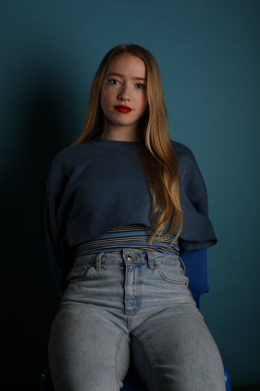
I like the look of this picture because of the pose that my model is doing. The blonde in her hair looks a lot warmer than previous picture however it doesn't clash with the blue.
|
Worst Photo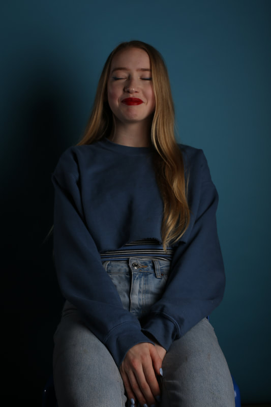
Again, here my model was caught off guard as the timing wasn't right.
|


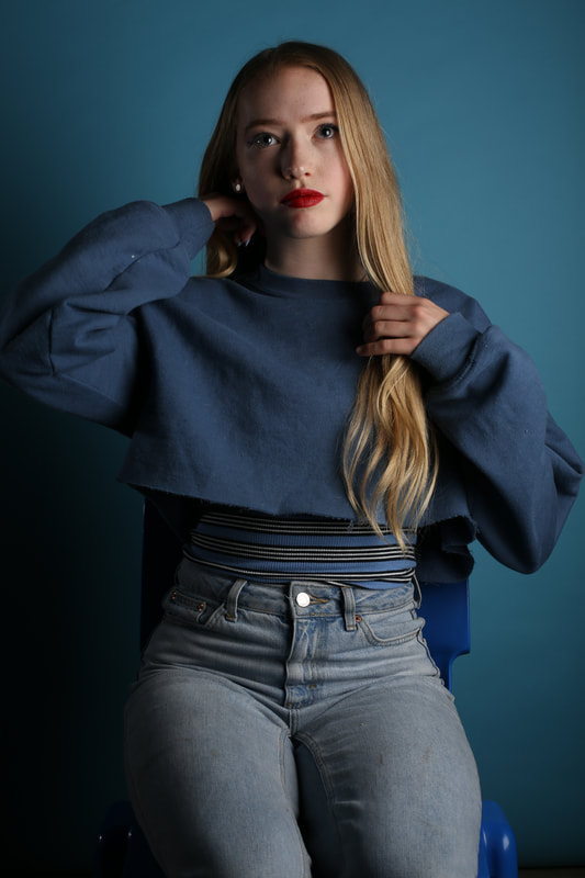
Best Photo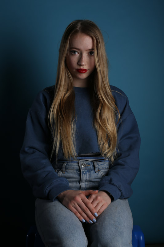
My favorite thing about this picture is how my model is positioned directly in the middle of the picture and her hair falls perfectly.
|
Worst Photo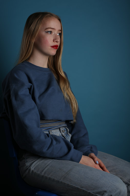
I only dislike this picture because I prefer when my model looks directly at the camera however I was experimenting with different looks and angles but it didn't work out positively.
|


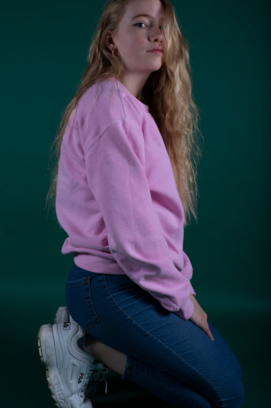
I then decided that I wanted to experiment with the lighting and turned off the soft box creating a warmer cast on the pictures, however I felt as though it took away from the studio look to the picture because previously, they looked more professional and I changed it back to normal.


Then she changed her outfit in order to experiment with different patterns aswell as the shades of blue.


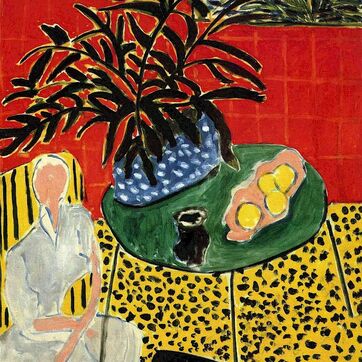
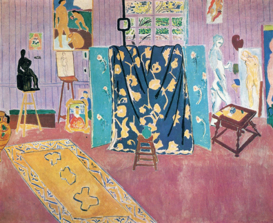
Henri Matisse
|
|
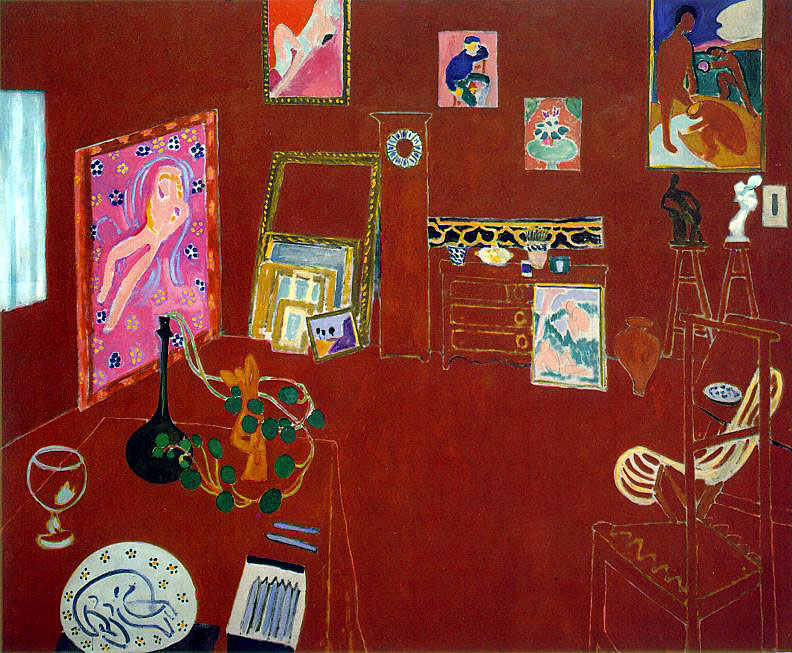
Titled: The Red Studio
Henri Matisse was a French artist known for his use of colour and was responsible for the developments in painting and sculpture.
This picture was published in 1911 and is now featured in The Museum Of Modern Art. In this picture he explores saturated colour as this picture is reduced down to only the colours featured in the picture, he uses a white outline to define objects such as the table, chairs and walls which was part of the illusion as Matisse dismantles the perceptive of the room. During this time this picture was quite shocking as he was one of the first people to do this. The use of Red ; the colour red was often looked at as the most aggressive colour and Matisse's intention was to create a huge impression on his audience by shocking them. Henri Matisse influences my work in photoshop, to incorporate his work into mine I could edit one of my photos to be completely bleached out and only choosing to define some objects in the picture making the appear more ambiguous and creative.
Experimenting With Photoshop
|
|
|


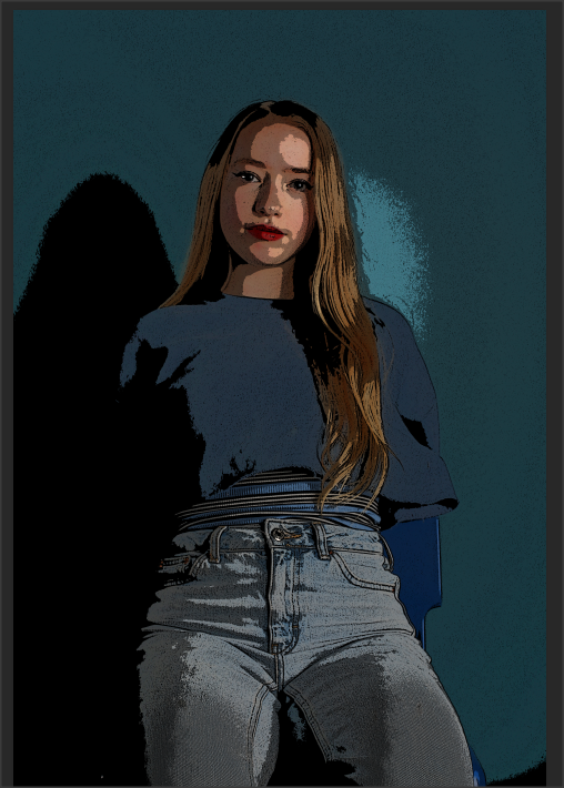
I explored different filters on Photoshop to add extra detail to my work however I felt like the outcome made my work look cheap in comparison the the HD pictures I had previously so I will not pursue this idea in my exam.
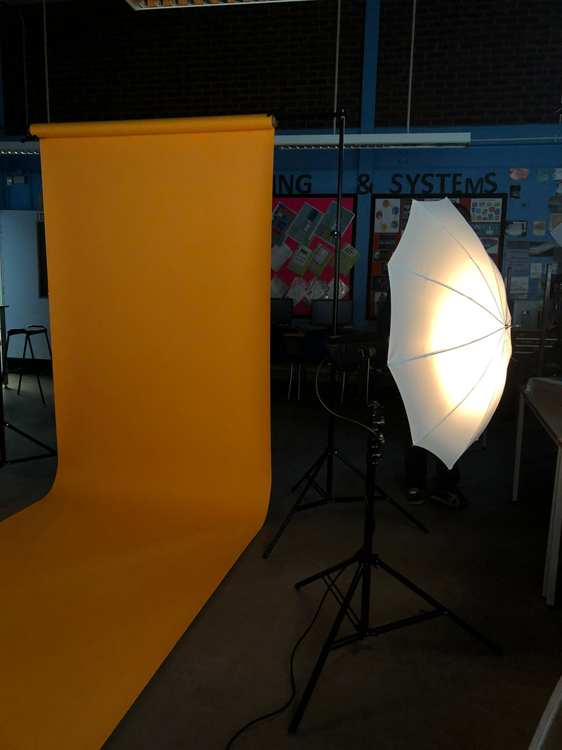
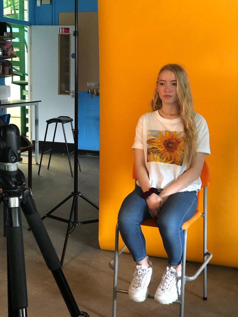
Plan for my 3rd shoot
|
|
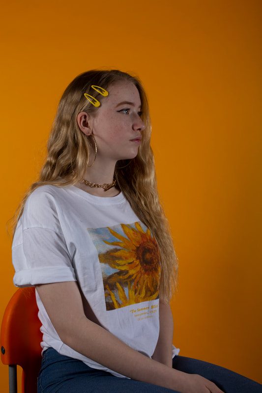
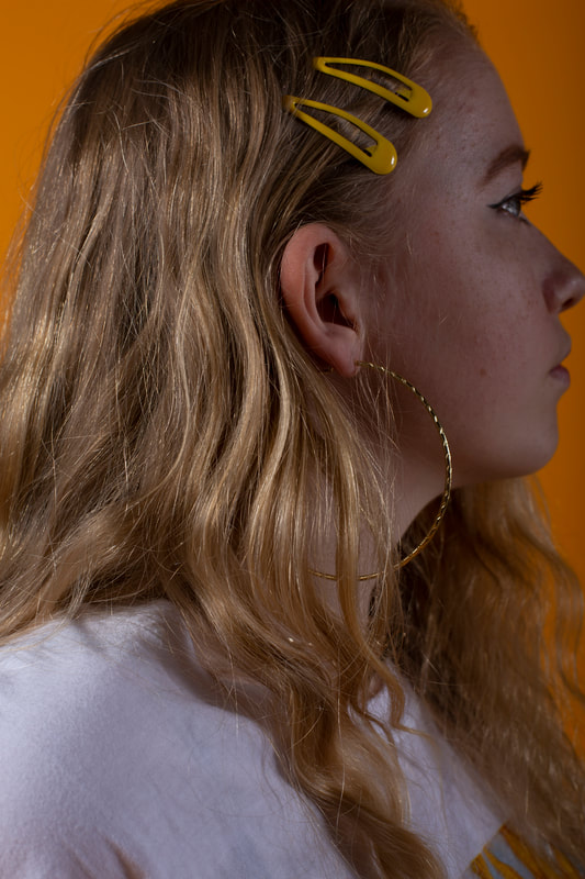
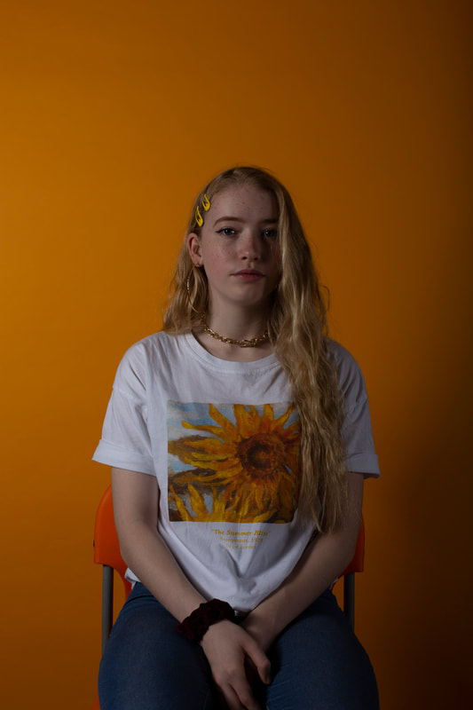
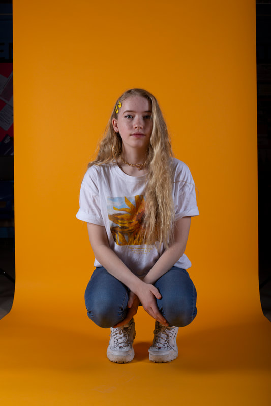
Yellow Shoot
|
|
|
|
|


Best Photo
This was my best picture because I was finally able to find the perfect lighting by adding a larger light and a reflector.
|
Worst Photo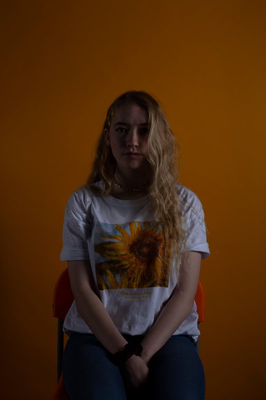
This picture is my worst picture because it was too dark and didn't capture the vibrant yellow that I had imagined.
|
Plan for my 4th Shoot
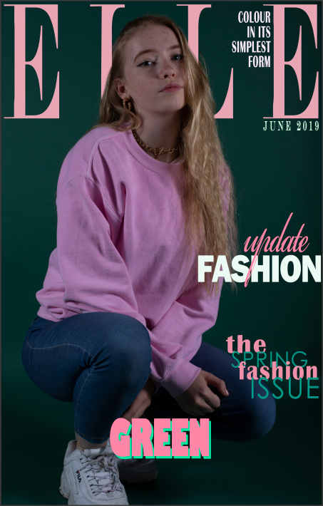
For this shoot I decided to experiment with different colours, contrasting each other as opposed to matching colours with the backdrop. I chose to do pink and green because those two are complimentary and link to my project theme exactly.
|
|
Green & Pink Shoot
|
|
|
|
|
|


|

|
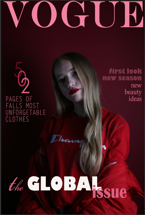
Exam
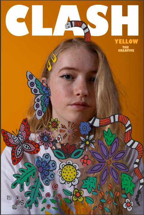
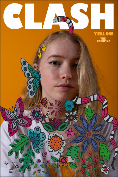
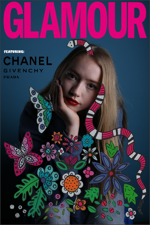
For my exam I will carry on exploring my theme of magazine covers however i will branch out from Vogue and try to recreate Glamour magazine.
29th April 2019,From this point I will not ouch my preparation work. The only work from this date will be created in my exam.


Evaluation
For Unit 1 I have researched lots of photographers for inspiration, such as Kia Hartelius,Martin Parr and Tolu Coker. I explored these photographers' techniques and photo structure to help me develop an idea of what sort of images work for different themes. One photographer whose work techniques and patterns i've explored closely is Kia Hartelius, as I particularly responded to her work and tried my best to present her themes. I think that her images are imaginative and skillful and I was keen to explore how to use contrasting and complimentary colours in my exam, I found her work after exploring a variety of different artists online in an attempt to find the perfect one which effectively captured my ideas. Her portfolio displays exactly what I was looking for reflecting my own ideas and aspirations. Her images influenced the way I grouped colours together as block colours however alternatively, Martin Parr experiments with different bold patterns as reflected in his collab with Gucci. He focuses on apposing colours rather than matching which inspired my final shoot because I chose to do alternating colours (pink and green) instead of pairing the clothes with the backdrop yet the colours still complimented each other. This allowed me to investigate a completely different look contributing to a rage of final outcomes.
Another message I interpreted from the artist research I have completed during the course of this project is that the deeper meaning of fashion, suggesting that it’s a form of self expression and creativity but it isn't being prioritised as other high profiled jobs or academic subjects.I think my project effectively brought to life the style and excitement that colour can bring to fashion and how a mixture of colours can present something so aesthetically pleasing and satisfy to look at as the beauty of art is highlighted through my work, or at least the potential that art and creativity has.
My initial thought with this exam question was neon lights or colour coordinating fruits and developing them into advertisements but as my researched developed I wanted to take my project In the direction of high fashion but still incorporating a form of advertisement, which turned out to be magazine covers. To make it more personal and continue with the idea of advertisement I used a personal model to show how colour can be shown simplistically on everyday people, alternately showing how big of a role colour plays in our lives & demonstrating its importance in an expressive way. This continuous research rooted from the ranges of artist and variety of work that had me intrigued as to how people make fashion personal to them and to how they've create their looks from nothing.
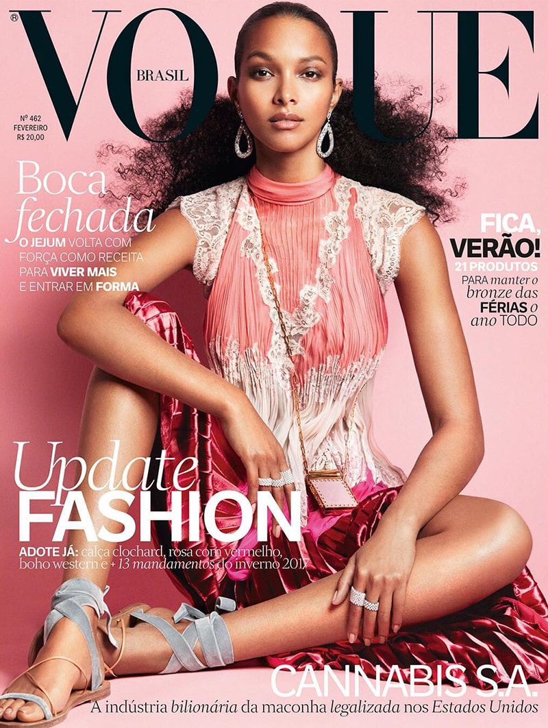
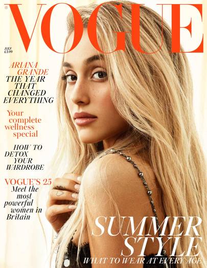
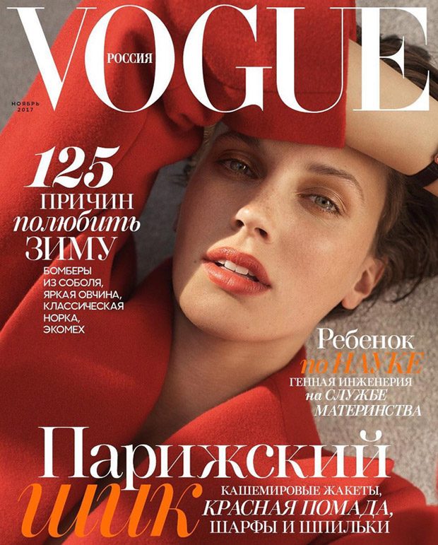
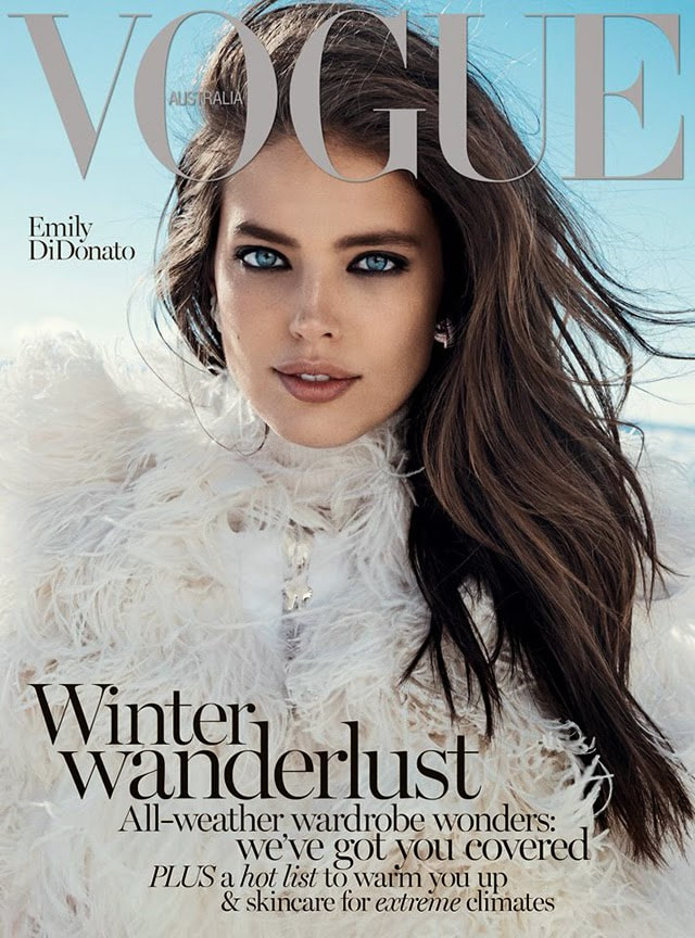
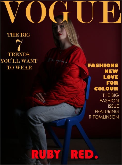
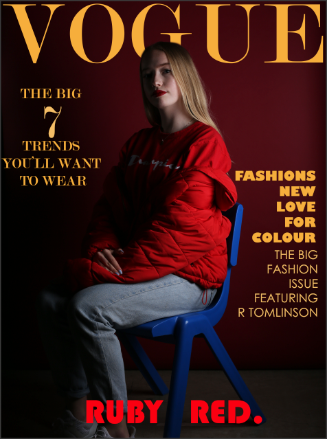
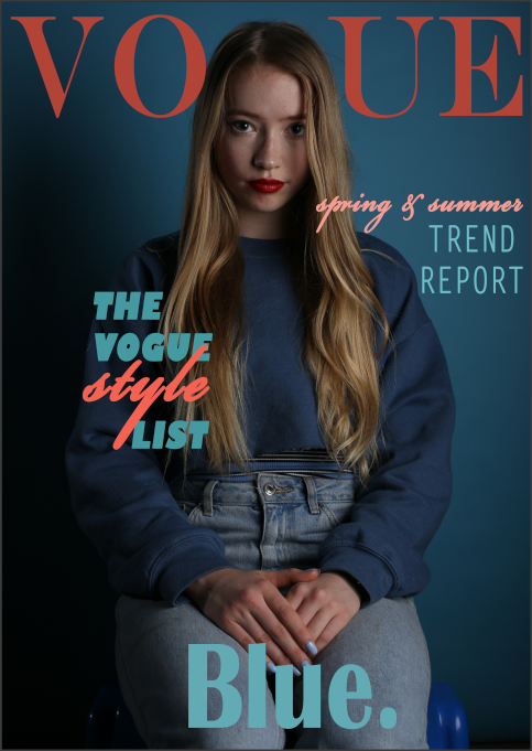
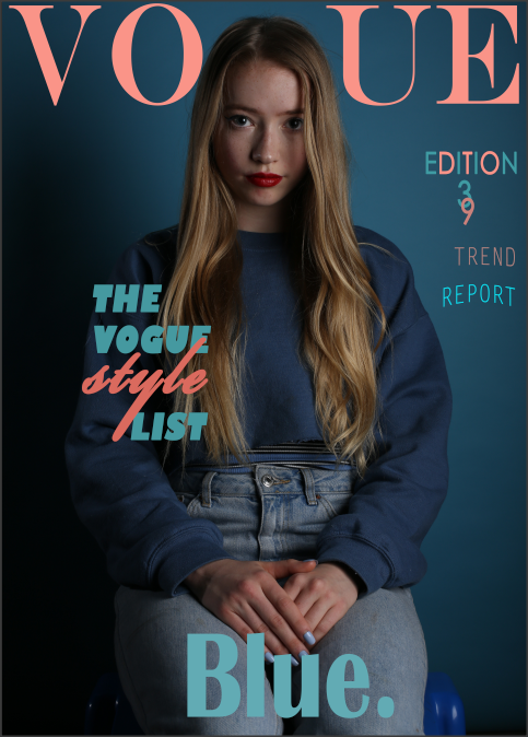
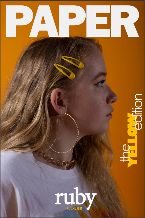
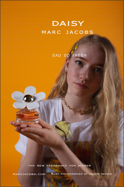
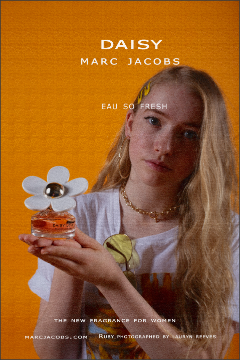
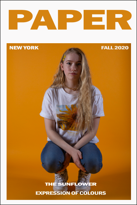
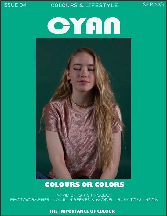
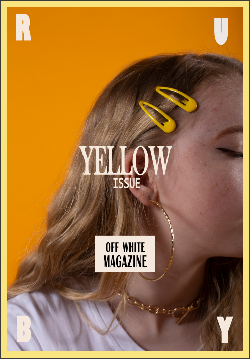
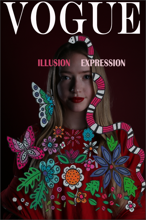
I've experimented on Photoshop using images from my first and second shoot (blue & red) and have photo shopped my third and final shoot (yellow and green)which were all shot with a professional photographer and set up, including studio lights and backdrops displaying vivid colour for my look. On tong first few few outcomes I used the red and blue shoot displaying my personal version of a Vogue, high fashion cover. I further experimented with colour by using colours to compliment each other in the text, bringing out the colours in the picture to bring my final out come together. To help start my Photoshop journey I watched a series of tutorials on YouTube to discover the right fonts and to experiment with different text types. I also branched our from Vogue covers and researched different fashion magazines ranging from simplistic ones with a couple words to ones that fill up a page but either way the range of ideas effectively helped to influence my ideas for my work on Photoshop. The main source of development on my project sourced from independent research which I believe helped my project come a long way.
My main final outcomes are a variety of magazine covers that accentuate the vivid colours and creativity in pictures I took of my model which I refined in Photoshop. I believe I have succeeded in exploring the theme of my project as I created a personal and meaningful response to it which for me represents the most success I could've achieved with this project .In my opinion the best part of this project would have to be when I was being given the opportunity and independence to set up my own shoot, capturing my own ideas and imagination. Manipulating my outcomes in Photoshop was also enjoyable but could start to become tedious because it requires a lot of concentration and effort, I truly believe that this project has allowed me to extend and expand my range of skills allowing me to become a better photographer. Furthermore If I was given an extended time frame I would try to challenge myself even further by taking a very detailed cover which includes actual drawings allowing me to incorporate artistic features, or experimenting with block colours to show how Henri Matisse
Another message I interpreted from the artist research I have completed during the course of this project is that the deeper meaning of fashion, suggesting that it’s a form of self expression and creativity but it isn't being prioritised as other high profiled jobs or academic subjects.I think my project effectively brought to life the style and excitement that colour can bring to fashion and how a mixture of colours can present something so aesthetically pleasing and satisfy to look at as the beauty of art is highlighted through my work, or at least the potential that art and creativity has.
My initial thought with this exam question was neon lights or colour coordinating fruits and developing them into advertisements but as my researched developed I wanted to take my project In the direction of high fashion but still incorporating a form of advertisement, which turned out to be magazine covers. To make it more personal and continue with the idea of advertisement I used a personal model to show how colour can be shown simplistically on everyday people, alternately showing how big of a role colour plays in our lives & demonstrating its importance in an expressive way. This continuous research rooted from the ranges of artist and variety of work that had me intrigued as to how people make fashion personal to them and to how they've create their looks from nothing.
I've experimented on Photoshop using images from my first and second shoot (blue & red) and have photo shopped my third and final shoot (yellow and green)which were all shot with a professional photographer and set up, including studio lights and backdrops displaying vivid colour for my look. On tong first few few outcomes I used the red and blue shoot displaying my personal version of a Vogue, high fashion cover. I further experimented with colour by using colours to compliment each other in the text, bringing out the colours in the picture to bring my final out come together. To help start my Photoshop journey I watched a series of tutorials on YouTube to discover the right fonts and to experiment with different text types. I also branched our from Vogue covers and researched different fashion magazines ranging from simplistic ones with a couple words to ones that fill up a page but either way the range of ideas effectively helped to influence my ideas for my work on Photoshop. The main source of development on my project sourced from independent research which I believe helped my project come a long way.
My main final outcomes are a variety of magazine covers that accentuate the vivid colours and creativity in pictures I took of my model which I refined in Photoshop. I believe I have succeeded in exploring the theme of my project as I created a personal and meaningful response to it which for me represents the most success I could've achieved with this project .In my opinion the best part of this project would have to be when I was being given the opportunity and independence to set up my own shoot, capturing my own ideas and imagination. Manipulating my outcomes in Photoshop was also enjoyable but could start to become tedious because it requires a lot of concentration and effort, I truly believe that this project has allowed me to extend and expand my range of skills allowing me to become a better photographer. Furthermore If I was given an extended time frame I would try to challenge myself even further by taking a very detailed cover which includes actual drawings allowing me to incorporate artistic features, or experimenting with block colours to show how Henri Matisse
